In a recent post, I searched a tiny percentage of the CRAN packages in order to check out the options for R functions that quickly and comprehensively summarise data, in a way conducive to tasks such as data validation and exploratory analytics.
Since then, several generous people have been kind enough to contact me with suggestions of other packages aimed at the same sort of task that I might enjoy. Always being grateful for new ideas, I went ahead and tested them out. Below I’ll summarise what I found.
I also decided to add another type of variable to the small test set from last time – a date. I now have a field “date_1” which is a Date type, with no missing data, and a “date_2” which does have some missing data in it.
My “personal preference” requirements when evaluating these tools for my specific use-cases haven’t changed from last time, other than that I’d love the tool to be able to handle date fields sensibly.
For dates, I’d ideally like to see the summarisation output acknowledge that the fields are indeed dates, show the range of them (i.e. max and min), if any are missing and how many distinct dates are involved. Many a time I have found that I have fewer dates in my data than I thought, or I had a time series that was missing a certain period. Both situations would be critical to know about for a reliable analysis. It would be great if it could somehow indicate if there was a missing block of dates – e.g. if you think you have all of 2017’s data, but actually June is missing, that would be important to know before starting your analysis.
Before we examine the new packages, I wanted to note that one of my favourites from last time, skimr, received a wonderful update, such that it now displays sparkline histograms when describing certain types of data, even on a Windows machine. Update to version 1.0.1 and you too will get to see handy mini-charts as opposed to strange unicode content when summarising. This only makes an already great tool even more great, kudos to all involved.
Let’s check how last time’s favourite for most of my uses cases, skimr, treats dates – and see the lovely fixed histograms!
library(skimr)
skim(data)

This is good. It identifies and separates out the date fields. It shows the min, max and median date to give an idea of the distribution, along with the number of unique dates. This will provide invaluable clues as to how complete your time series is. As with the other data types, it clearly shows how much missing data there is. Very good. Although I might love it even more if it displayed a histogram for dates that showed the volume of records (y) per time period (x; granularity depending on range), giving a quick visual answer to the question of missing time periods.
The skim-by-groups output for dates is equally as sensible:
library(dplyr)
library(skimr)
group_by(data, category) %>% skim()

Now then, onto some new packages! I collated the many kind suggestions, and had a look at:
- CreateTableOne, from the tableone package
- desctable from desctable
- ggpairs from GGally
- ds_summary_stats from Descriptr
- I was also going to look at the CompareGroups package, but unfortunately it had apparently been removed from CRAN recently because “check problems were not corrected in time” apparently. Maybe I’ll try again in future.
CreateTableOne, from the tableone package
library(tableone)
 CreateTableOne(data = data)

Here we can easily see the count of observations. It has automatically differentiated between the categorical and numeric variables, and presented likely appropriate summaries on that basis. There are fewer summary stats for the numeric variables than I would have liked to see when I am evaluating data quality and similar tasks.
There’s also no highlighting of missing data. You could summarise that “type” must have some missing data as it has fewer observations than exist in the overall dataset, but that’s subtle and wouldn’t be obvious on a numeric field. However, the counts and percentage breakdown on the categorical variables is very useful, making it a potential dedicated frequency table tool replacement.
The warning message shows that date fields aren’t supported or shown.
A lot of these “limitations” likely come down to the actual purpose this tool is aimed at. The package is called tableone because it’s aimed at producing a typical “table 1” of a biomedical journal paper, which is often a quantitative breakdown of the population being studied, with exactly these measures. That’s a different and more well-specified task than a couple of use-cases I commonly use summary tools for, such as getting a handle on a new dataset, or trying to get some idea of data quality.
This made me realise that perhaps I am over-simplifying to imagine a single “summary tool” would be best for every one of my use-cases. Whilst I don’t think CreateTableOne’s default output is the most comprehensive for judging data quality, at the same time no journal is going to publish the output of skimr directly.
There are a few more tableone tricks though! You can summary() the object it creates, whereupon you get an output that is less journaly, but contains more information.
summary(CreateTableOne(data = data))

This view produces a very clear view of how much data is missing in both absolute and percentage terms, and most of the summary stats (and more!) I wanted for the numeric variables.
tableone can also do nice summarisation by group, using the “strata” parameter. For example:
CreateTableOne(strata = "category", data = data)

You might note above that not only do you get the summary segmented by group, but you also automatically get p values from a statistical hypothesis test as to whether the groups differ from each other. By default these are either chi-squared for categorical variables or ANOVA for continuous variables. You can add parameters to use non-parametric or exact tests though if you feel they are more appropriate. This also changes up the summary stats that are shown for numeric variables – which also happens if you apply the nonnormal parameter even without stratification.
For example, if we think “score” should not be treated as normal:
print(CreateTableOne(strata = "category", data = data), nonnormal = "score")

Note how “score” is now summarised by its median & IQR as opposed to “rating”, which is summarised by mean and standard deviation. A “nonnorm” test has also been carried out when checking group differences in score, in this case a Kruskal Wallis test.
The default output does not work with kable, nor is the resulting summarisation in a “tidy” format, so no easy piping the results in or out for further analysis.
desctable, from the desctable package
library(desctable)
desctable(data)

The vignette for desctable describes how it is intended to fulfil a similar function to the aforementioned tableone, but is built to be customisable, manipulable and fit in well with common tidy data tools such as dplyr.
By default, you can see it shows summary data in a tabular format, taking into showing appropriate summaries based on the type of the variables (numeric vs categorical, although it does not show anything other than counts of non-missing data for dates). The basic summaries are shown, although, like tableone, I would prefer a few more shown by default if I was using it as an exploratory tool. Like tableone though, exploratory analysis of messy data is likely not really its primary aim.
The tabular format is quite easy to manipulate downstream, in a “tidy” way. It actually produces a list of dataframes, one containing the variable names and a second containing the summary stats. But you can as.data.frame() it to pop them into a standard usable dataframe.
I did find it a little difficult to get an quick overview at a glance in the console. Everything was displayed perfectly well – but it took me a moment to make my conclusions. Perhaps part of this is because the variables of different types are all displayed together, making me take a second to realise that some fields are essentially hierarchical – row 1 shows 60 “type” fields, and rows 2-6 show the breakdown by value of “type”.
There’s no special highlighting of missing data, although with a bit of mental arithmetic one could work out that if there are N = 64 records in the date_1 field then if there are 57 entries in the date_2 field, we must be missing at least 7 date_2 entries. But there’s no overall summary of record count by default so you would not necessarily know the full count if every field has some missing data.
It works nicely with kable and has features allowing output to markdown and html.
The way it selects which summaries to produce for the numerical fields is clever. It automatically runs a Shapiro-Wilk test on the field contents to determine whether it is normally distributed. If yes, then you get mean and standard deviation. If no, then median and inter-quartile range. I like the idea of tools that nudge you towards using distribution-appropriate summaries and tests, without you having to take the time (and remember) to check distributions yourself, in a transparent fashion.
Group comparison is possible within the same command, by using the dplyr group_by function, and everything is pipeable – which is a very convenient method for those of already immersed in the tidyverse.
group_by(data, category) %>%
 desctable()

The output is “wide” with lengthy field names, which makes it slightly hard to follow if you have limited horizontal space. It might also be easier to compare certain summary stats, e.g. the mean of each group, if they were presented next to each other when the columns are wide.
Note also the nice way that it has picked an appropriate statistical test to automatically test for significant differences between groups. Here it picked the Kruskall-Wallis test for the numeric fields as the data was detected as being non-normally distributed.
Although I am not going to dive deep into it here, this function is super customisable. I mentioned above that I might like to see more summary stats shown. If I wanted to always see the mean, standard deviation and range of numeric fields I could do:
desctable(data,stats = list("N" = length, "Mean" = mean, "SD" = sd, "Min" = min, "Max" = max))

You can also include conditional formulae (“show stat x only if this statement is true”), or customise which statistical tests are applied when comparing groups.
If you spent a bit of time working this through, you could probably construct a very useful output for almost any reasonable requirements. All this and more is documented in the vignette, which also shows how it can be used to generate interactive tables via the datatable function of DT.
ggpairs, from the GGally package
library(GGally)
ggpairs(data)

ggpairs is a very different type of tool than the other summarising tools tried here so far. It’s not designed to tell you the count, mean, standard deviation or other one-number summary stats of each field, or any information on missing data. Rather, it’s like a very fancy pairs plot, showing the interactions of each of your variables with each of the others.
It is sensitive to the types of data available – continuous vs discrete, so makes appropriate choices as to the visualisations to use. These can be customised if you prefer to make your own choices.
The diagonal of the pairs plot – which would compare each variable to itself, does provide univariate information depending on the type of the variable. For example, a categorical variable would, by default, show a histogram of the its distribution. This can be a great way to spot potential issues such as outliers or unusual distributions. It also can may reveal stats that could otherwise be represented numerically, for instance the range or variance, in a way often more intuitive to humans.
It looks to handle dates as though they were numbers, rather than as a separate date type.
There isn’t exactly a built-in group comparison feature, although the nature of a pairs plot may mean relevant comparisons are done by default. You can also pass ggplot2 aesthetics through, meaning you can essentially compare groups by assigning them different colours for example.
Here for example is the output where I have specified that the colours in the charts should reflect the category variables in my data.
ggpairs(data, mapping = aes(colour = category))

As the output is entirely graphic, it doesn’t need to work with kable and obviously doesn’t produce a tidy data output.
I wouldn’t categorise this as having the same aim as the other tools mentioned here or in the past post – although I find it excellent for its intended use-case.
After first investigating data with the more conventional summarisation tools to the point I have a mental overview of its contents and cleanliness, I might often run it through ggpairs as the next step. Visualising data is often a great, sometimes overlooked, method to increase your understanding of a dataset. This tool will additionally allow you to get an overview of the relationship between any two of your variables in a fast and efficient way.
ds_summary_stats from descriptr
library(descriptr)
ds_summary_stats(data$score)

descriptr is a package that contains several tools to summarise data. The most obvious of these aimed at my use cases is “ds_summary_stats”, shown above. This does only work on numeric variables, but the summary it produces is extremely comprehensive. Certainly every summary statistic I normally look at for numeric data is shown somewhere in the above!
The output it produces is very clear in terms of human readability, although it doesn’t work directly with kable, nor does it produce tidy data if you wished to use the results downstream.
One concern I had regards its reporting of missing data. The above output suggests that my data$score field has 58 entries, and 0 missing data. In reality, the dataframe contains 64 entries and has 6 records with a missing (NA) score. Interestingly enough, the same descriptr package does contain another function called ds_screener, which does correctly note the missing data in this field.
ds_screener(data)

This function is in itself a nicely presented way of getting a high-level overview of how your data is structured, perhaps as a precursor to the more in-depth summary statistics that concern the values of the data.
Back on the topic of producing tidy data: another command in the package, ds_multi_stats, does produce tidy, kableable and comprehensive summaries that can include more than one variable – again restricted to numeric variables only.
I also had problems with this command fields that contained missing data – with it giving the classic “missing values and NaN’s not allowed if ‘na.rm’ is FALSE.” error. I have to admit I did not dig deep to resolve this, only confirming that simply adding “na.rm = TRUE” did not fix the problem. But here’s how the output would look, if you didn’t have any missing data.
ds_multi_stats(filter(data, !is.na(score)), score, rating)

There is also a command that has specific functionality to do group comparisons between numeric variables.
ds_group_summary(data$category, data$rating)

This one also requires that you have no missing data in the numeric field you are summarising. The output isn’t for kable or tidy tools, but its presentation is one of the best I’ve seen for making it easy to visually compare any particular summary stat between groups at a glance.
Whilst ds_summary_stats only works with numeric data, the package does contain other tools that work with categorical data. One such function builds frequency tables.
ds_freq_table(data$category)
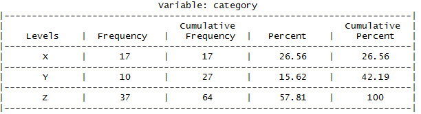
This would actually have been a great contender for my previous post regarding R packages aimed at producing frequency tables to my taste. It does miss information that I would have liked to have seen regarding the presence of missing data. The percentages it displays are calculated out of the total non-missing data, so you would be wise to first pre-ensure you that your dataset is indeed complete, perhaps with the afore-mentioned ds_screener command.
Some of these commands also define plot methods, allowing you to produce graphical summaries with ease.

Do you have some kind of workflow to automate publishing your R Notebooks (?) to WordPress? Can you update it? If so, I’d love to know what you’re using. Thanks.
LikeLiked by 1 person
Hi – I’m afraid I don’t have anything fancy or automatic for this. Presently I just tend to copy and paste or screenshot from R.
I should definitely look into cleverer ways! I have heard that people have success publishing R with the blogdown package at https://github.com/rstudio/blogdown although I have not yet tried it.
Thanks,
Adam
LikeLike
Ah ok, thanks for answering!
LikeLike
A very interesting post.
The compareGroups package is available from CRAN again since sone months ago. Also, the latest 4.0 version can be installed from github
devtools ::install_github (“isubirana/compareGroups”)
This version handles date variables and export2md function to insert tables in markdown documents has been improved.
I think compareGroups package match most of the good properties you mentioned in your former post.
LikeLike
Hi – thanks for letting me know. It sounds like compareGroups will be a great tool for what I was after. I look forward to trying it out shortly!
LikeLike
You should have a look at the sj package series (sjplot, sjmisc etc,)
LikeLike