New year, new blog post, new tool version to play with! It’s clear that the field of data-related stuff progresses extremely rapidly at present, and hence it behoves those of us of an analyst bent to, now and then, go explore tools that we don’t use day-to-day. We may already have our favourites in each category, but, unless we’ve done a recent review, it’s quite possible the lesser-loved packages have developed a whole new bunch of goodies since the last checkup.
With that in mind, I’ve taken a look at the latest version of Microsoft Power BI. It’s billed in this manner by its creators:
Power BI transforms your company’s data into rich visuals for you to collect and organize so you can focus on what matters to you.
It’s therefore an obvious competitor for software like Tableau, Qlikview, chart.io, and many others, and largely can replace Microsoft’s previous PowerView offering, which was accessed directly via Excel. In a similar way to the Tableau suite, there’s a Power BI desktop package that analysts install locally on their computer primarily to manipulate data and construct visuals, and a web-based Power BI service that allows for publication and distribution of the resulting file. Actually the online service is pretty powerful in terms of allowing you to create reports and dashboards via the web, and includes a few other nifty features designed to improve the usability of this software genre – so even some analysts might get a lot out of the web-based version alone.
A lot of Power BI is actually free of charge to use, although there is an enhanced “Pro” edition at around US$10 a month, replete with plenty of more enterprisey features as you can see on their comparison chart. If you’re working somewhere with an Office 365 subscription, you might find you already have access to Power BI, even if you didn’t know about it. So, there’s not much to stop you having a play with it if you’re even remotely interested.
Anyhow, this post is not to review Power BI overall, but rather to point out 5 features that stood out to me as not being present in my current dataviz software of choice, Tableau. These therefore aren’t necessarily the general “5 best features of Power BI” – both Tableau and Power BI can create a pretty line chart, so it’s not really worth pointing that out in this context. My choices should then really be considered from the context of someone already deeply familiar with what Tableau or other competitors already offer.
Also note that software packages aren’t supposed to be feature-identical; many programs aimed at solving the same sort of problems may be completely different in their philosophy of design. Adding some features necessitates a cost in terms of whether other features can be supported. This then is not a request to Tableau and competitors to copy these features. But I do vehemently think it’s useful for day-to-day data practitioners to remain aware of what software features are out there in the wild today, just case it gives you a better option to solve a particular problem you encounter one day.
As a spoiler: for what it’s worth, my dive into Power BI hasn’t resulted in me throwing my lovely copy of Tableau away, not a chance; you can pry that from my cold dead hands etc. There’s a certain fluidity in Tableau, especially when used for adhoc analysis, that I’ve not yet encountered in its more obvious competitors, which seems very conducive to digging for insights.
But it has led me to believe that the Microsoft offering has improved substantially since the time years ago I used to battle against v1 PowerPivot (which itself was great for some specific data manipulation activities…but eventually I got tired of the out-of-memory errors!). And, especially due to the way its licensed – to be blunt, far cheaper than Tableau for some configurations – it’ll remain in my mind when considering tools for future projects.
So, in no particular order, here’s some bits and pieces that piqued my curiosity:
1: Focus mode
Let’s start with a simple one. Dashboards typically contain several charts or tables that are designed to provide insight upon a given topic. Ideally the combination of content that makes up a dashboard should usually fit on a single screen, and an overall impression of “is it good or bad news?” should be available at a glance.
In designing dashboards, especially those that are useful for multiple audiences, there’s often therefore a tension between providing enough visualisations such that every user has the information they need, vs making the screen so cluttered or hard to navigate through that no user enjoys the experience of trying to decipher 1-inch square charts whatsoever.
For cases where a particular chart on a dashboard is of interest to a user, Power BI has a “focus” mode that allows the observer to zoom in and interact with that single chart on a dashboard or report on a near-fullscreen basis, without requiring any extra development work on the part of the analyst.
It’s a simple enough concept – the user just clicks a button on whichever visualisation they’re interested in, and it zooms in to fill up most of the screen until they click out of it. It keeps its original interactivity, plus displays some extra meta-information that might be useful (last refresh time etc.). But the main point is it becomes big enough to potentially help generate deeper insights for a particularly interested end user in a way that a little 1 inch square chart shoved at the bottom of a dashboard might struggle to do, even if the 1 inch version is more appropriate for the average dashboard viewer.
If that description isn’t clear, then it’s probably better seen in video form. For example:
2: Data driven alerts
Regular readers might have established that I’m a big fan of alerting, when it comes to trying to promote data driven decision making. I’m fairly convinced that many dashboards come with a form of “engagement decay”, where the stakeholder is initially obsessively excited with their ability to access data. But as time goes on they get quite bored of checking to see if everything’s OK – especially if everything usually is OK – and hence stop taking the time to consult a potentially valuable source of decision making.
So, for these types of busy execs, and anyone else wanting to optimise productivity, I like alerts. Just have the dashboard send some sort of notification whenever there’s actually something “interesting” to see.
Sure enough, Power BI has the capacity to alert the user upon certain KPI events, via its own web-based notification centre or, more usefully, email or phone app.
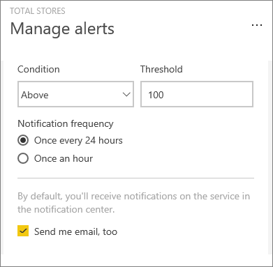
The implementation is pretty simple and somewhat restrictive at the moment. Alerts can only be set up on “numeric tiles featuring cards, KPIs, and gauges”, the alert triggers are basic above X or below X type affairs, and you’re restricted to being alerted once an hour or once a day. So there’s a lot of potential room for development – I’d like to see statistical triggers for instance – “alert me if something unusual happens”.
The good news for Tableau users is that Tableau has promised a similar feature will be coming to their software in the future (and to some extent an analyst can create similar functionality event now with the “don’t send email if view is empty” option recently added). But if you want a nice simple “send me an email whenever my sales drop below £10,000” feature that non-analytical folks can easily use, then Power BI can do that right now.
3: Custom visualisations
All mainstream dataviz products should be able to squeeze out the tried-and-tested basic varieties of visuals; line chart, bar chat, scatterplot et al. And >= 90% of the time this is often enough, in fact usually the best approach for clarity. But sometimes, for better or worse, that’s not sufficient for certain use-cases. You can see this tension surfacing within the Tableau community where, despite the large number of proven chart types it can handle, there are even larger number of blogs, references documents et al. as to what form one has to coerce your data into order to simulate more esoteric visualisation types within software that has not been natively designed to produce them.
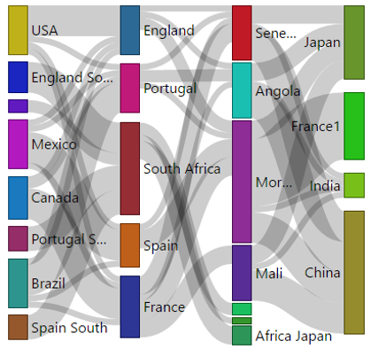
A couple of common examples in recent times would include Sankey charts or hexagonal binning. Yes, you can construct these types of viz in Tableau and other competing products – but it requires a bit of workaroundy pre-work, and entirely interrupts the naturalistic method of exploring data that these tools seek to provide. For example, an average user wishing to construct a Sankey chart in Tableau, may want to search out and thoroughly read one or many of a profusion of useful posts, including those here, here, here, and here and several more places throughout the wilds of the web.
It’s very cool that these resources exist – but imagine if instead of having to rely on researching and recreating clever people’s ingenious workarounds, an expert could just provide a one-click solution to your problem. Or you could share your genius more directly with your peers.
Power BI presents an API where an advanced user can create their own visualisation types. These then integrate within Power BI’s toolbox, as though Microsoft had provided them in the base package. Hence data vizzers of all skill levels can use that type of visual without the need for any programming or mathematical workarounds. It should be noted that the procedure for creating these does require learning a superset of Javascript called Typescript, which would certainly not be expected of most Power BI audiences.
But this barrier is alleviated via the existence of a public gallery of these visualisations that Microsoft maintains, which allows generous developers to share their creations world-wide. A Power BI user wouldn’t have to think about the mathematical properties underyling a Sankey plot – they could just download a Sankey chart type addin such as this one.
Now, this open access does introduce some risks of course. Thanks to Spiderman, we all know what great power comes with. And even on the public custom visuals gallery, you’ll see some entries that, well, let’s say Stephen Few might object to.

Bonus feature: you can also display native R graphics in your Power BI dashboard, with some limitations.
4: “Pin anything to dashboard” for non-analyst end users
To understand this one, you need to know something about the Power BI object types. Simply that a “report” is made out of a “dataset”, and a “dashboard” is usually, but not exclusively, made out of components of reports*. A dataviz expert can publish any combination of those (or even publish a mixed set of them as a content pack, which any interested users can download to use with a few clicks – another potentially nifty idea!).
(* Tableau users – you can then think of a report as a worksheet, but a worksheet that can support multiple vizzes with arbitrary placement.)
Reports are what they sound like; the electronic equivalent of a notebook with between zero and many data visualisations on each page concerning a particular topic. Note though an important limitation of being restricted to a single datasource per report. In Power BI you create reports with the simple drag and drop of charting components and configurations, after selecting the appropriate datasource. Charts stick around, in interactive form, wherever you drag them to, almost as though you were making a Powerpoint slide. No “containers” needed, Tableau-fans 🙂
Dashboards however have a more fixed format; always appearing as though they were a set of tiles, each with a different item in. There’s no restriction on data sources, but some restrictions on functionality; such as no-cross filtering between independent tiles. A dashboard tile can be any viz from any report, a whole report itself (which can then cross-filter within the scope of the report) or some miscellaneous other stuff including “live” Excel workbooks, static images, and even answers to natural language questions you may have asked in the fancy Q&A functionality (“what were our sales last month?”).
So, what’s this about non-analysts? Well, a difference between Power BI dashboards and those from some other tools is that even people considered as as being solely viz consumers can legitimately create their own dashboards. A non-analytical end-user can choose to pin any individual chart from any individual report (or the other types of items listed above) to a new dashboard and hence create a smorgasbord showing exactly the parts of each report / pre-made dashboard they are actually interested in all on one page. After all, the individual viz consumer is by definition best placed to know what’s most important to them.
Here’s what that looks like in reality:
This is perhaps one approach to solving the problem that often in reality the analyst is designing a dashboard for an multi-person audience, within which each individual has slightly different needs. Each user might be interested in a different 3 of the 5 charts in your dashboard. Here, each user could then choose to pin their favourite 3 to their own start up page, or any other dashboard they have control over, together with their favourite data table from another report and most loved Excel workbook, if they insist.
How this actually plays out in practice with novice users would be interesting to see. I think a certain type of non-analyst power user would find this pretty useful, and it’s a more realistic a concept of “even non-analysts can make dashboards with no training” than a lot of these types of tools foolishly promise.
5: More powerful data manipulation tools
This one is more for advanced users. Power BI lets you manipulate the data (you might even say business-user “ETL”) before you start employing it in your visualisations. Most dashboarding tools likely let you do this to some extent – Tableau recently improved its ability to union data for instance, together with some cleaning features, and it’s had joining and blending for a while. You can also write VizQL formulae to produce calculations at the time of connecting to data.
Power BI’s query editor seems to be more powerful than many, with a couple of particular nice features.
Firstly, it uses a language called ‘M’ which is specifically designed with data mashups in mind. Once you’ve obtained your data with the query editor, you can then go on to use the DAX language (designed for data analysis, and whose CALCULATE() function has a soft spot in my heart from previous projects) throughout Power BI in terms of working on data you already have access to.
The query editor is fully web-data enabled; even scraping data right off appropriately formatted web pages without any scripting work at all. Here’s the Microsoft team grabbing and applying a few transforms to IMDB data.
One query-editor feature I particularly like somewhat addresses the disadvantage that some of these user-friendly manipulation tools have vs scripting languages like R; that of reproducibility.
In Power BI, as you go through and apply countless modifications to your incoming dataset, a list of “applied steps” appears to the side of your data pane. Here’s an example from the getting started guide.

It’s a chronological list of everything you’ve done to manipulate the data, and you also have the ability to go back and delete or edit the steps as you please. No more wondering “how on earth did I get the data into this format?” after an hour of fiddling around transforming data.
There’s plenty of built-in options for cleaning up mucky data; including unpivoting, reordering, replacing values and a fill-down type operation that fills down data until it next sees a value in the same column, which handles those annoying Excel sheets where each group of rows only has its name filled in on the top row. Unioning and joining is of course very possible, and you’ll have access to a relationships diagram view, for anyone who fancies having a look at, or modifying, how tables relate to each other.
Analysts are not limited to connecting to existing data either. Non-DBA types can create new tables directly in Power BI and type or paste data directly into them if you wish (although I’d be wary of over-using this feature…be sure to future-proof your work!). You can also upload your standard Excel workbooks directly to the service for web Power BI to access to its underlying data.
If Power BI already has the data tables you want, but they’re just formatted suboptimally or over-granular, then you can use DAX to create calculated tables whereby you use the contents of other imported tables to build your own in-memory virtual table. This might allow you to, for instance, reduce your use of intermediate database temporary tables for some operations, perhaps performing some 1-time aggregation before analysing for instance.

This is a surprisingly acute list. Usually when I look at these comparisons, the features listed are pretty vapid, but you do a good job of calling out how the feature is useful in the real world. Number 5 is hands-down, the biggest thing PowerBI has over Tableau. The ability to access and munge data into a format well-suited for analysis is where Tableau lacks strength more than any other area.
LikeLike
Thanks so much for this article. I’m wondering if you can help me understand something. Many articles/reviews indicate Power BI can be sluggish when working with extremely large data sets. My question is, what is “large”? At what size does a data set have to be where I will start to see the slowdown?
LikeLike
That depends on a number of factors – and also where the sluggishness shows up. For loaded data models, when people talk about sluggish, they may be talking about how fast the charts respond when you take an action like filter, slice, or highlight. How fast this performs is largely a function of how sharp your data model is. If you’ve got a 3-table model, only a handful of columns, and low cardinality (that is, how many unique values a column may have) – the engine can handle craploads of records (100’s of millions) no problem. When you start diversifying the data a lot, widening the tables, or begin straying from tried and true design patterns – PowerBI was really purpose built for a star schema – that’s when you’ll start running into problems. How well-written and complex the DAX is will also have a resounding influence on this. Google around for different ways to count distinct in DAX, and you will see there are all kinds of performance implications for doing it different ways.
On the Query side, how fast a model loads also depends on a number of factors. How well-performing your source is has obvious implications. The steps and complexity of the transforms you do have widely different characteristics as well. In general, I try to have the source server do as much of the work as possible, which means doing as many of the transforms that are natively available in the source as possible first. When you add a step in the query interface that can’t be done by the server dishing out data, the data is imported to the machine running PowerBI to do the rest of the work. If you’re calling a table that contains millions of records, there is a huge hit just in bandwidth moving data over a network, let alone compute power. In general (very general) – a well formed set of queries that pulls from a reasonably performing source should be able to bring in millions of records without too much “sluggishness” though everyone’s definition is different.
When you start running into that sluggishness, the best first steps you can do is to reduce the footprint. Identify fields and rows that you don’t need and get rid of them. Do as much filtering and reduction of unique values as possible without breaking the reports. From there, use a tool like DAX Studio to identify where the bottlenecks are and work on the DAX. If you get to this point, and it’s still sluggish, you may simply be at a point where two smaller/narrower models are warranted. If you have very targeted models, many hundreds of millions of records should not be out of the question – and realistically, it’s a very small percentage of users dealing with that kind of volume.
LikeLike
Connect with us if you are thinking to implement Microsoft Power BI, migrate from Tableau to Power BI, augment Power BI expertise to ramp-up business intelligence initiatives. Use our Agile Power BI Proof of Concept as a Catalyst to move ahead.
https://goo.gl/Hh5owC
LikeLike
I can suggest to visit to you a site on which there is a lot of information on a theme interesting you.
LikeLike
Thanks for adding your comment. It’s always appreciated!
LikeLike